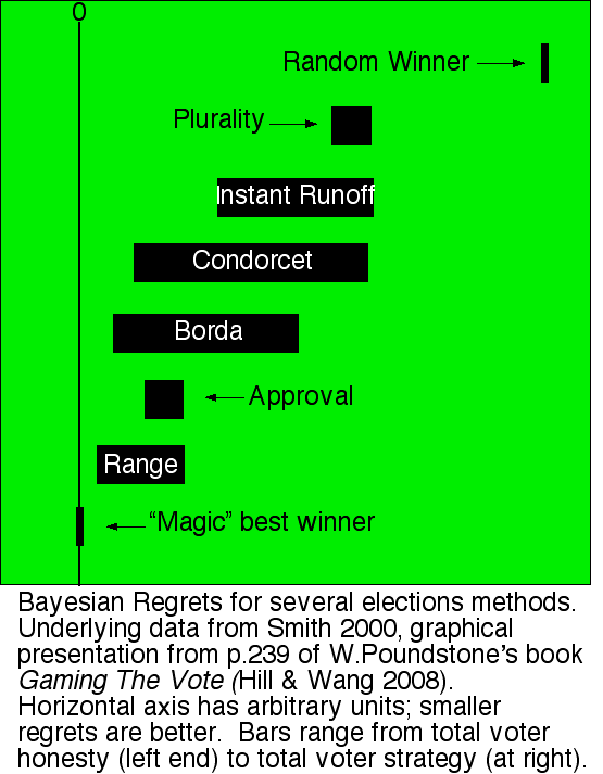
The text (quoted from W.Poundstone's book) accompanying this figure reads:
In every one of Smith's 144 simulations, using a wide variety of parameters, range voting did the best of any practical voting system, having the lowest regret (next only to "magic" best).
One message of Smith's simulations is the surprising value of honesty. Every system produced less regret when the voters were honest. In most cases the improvement is dramatic. This sample chart shows the results of a simulation with 200 voters, 5 candidates, and two ideological issues. The bars show Bayesian Regret. The left side of each bar indicates the regret when everyone votes honestly. The right side gives the regret when everyone votes strategically. Remember, this works like a golf score: lower is better.
For comparison, the chart also shows the "random winner" system where the votes are ignored and the winning candidate is chosen randomly. All reasonable voting systems are much better than that (as we'd hope).
Whenever you see a graph intended to convince you of something, you should be concerned about "cherry picking." Did I choose this particular simulation just to make range voting look good? How different are the 143 simulations I'm not showing?
I chose this simulation because it strikes me as Smith's most realistic simulation overall. It has the most voters (200; adding voters eats up processor cycles) and the most candidates (five). I suspect the two-dimensional utility [issue space] used here is a better approximation to American political reality than Smith's other alternatives.
These variables don't affect the overall shape of the results much. Nearly all... would look very similar to this chart. The main difference is the degree of bar overlap. E.g, it is not always the case that the worst value for range voting is better than the best value for IRV as it is here.